

German industrial designer Dieter Rams championed simplicity through the iconic products he created at Braun, later inspiring Apple’s design philosophy and generations of innovators. I credit the Exploratorium with influencing me personally to become an engineer through the joy of exploring their mechanical exhibits as a kid. And now, more important than ever in the age of AI, I’m hugely inspired by IDEO’s commitment to making products that are human-first.
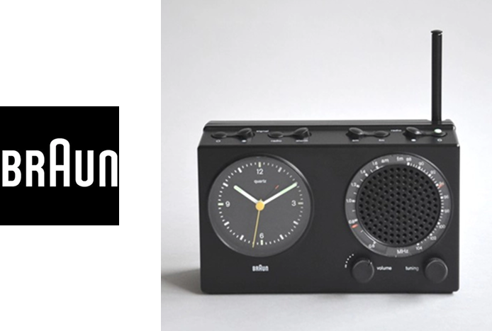
Braun: Simplicity
Braun is a premium German consumer products company famous for its minimalist, functional, and modernist industrial design. It represents excellence in design and the pursuit of simplicity. Its logo is bold by being so straightforward. It’s distinguishing features being only an enlarged middle “A” giving the logo a focal point and structural axis around B/R and U/N.
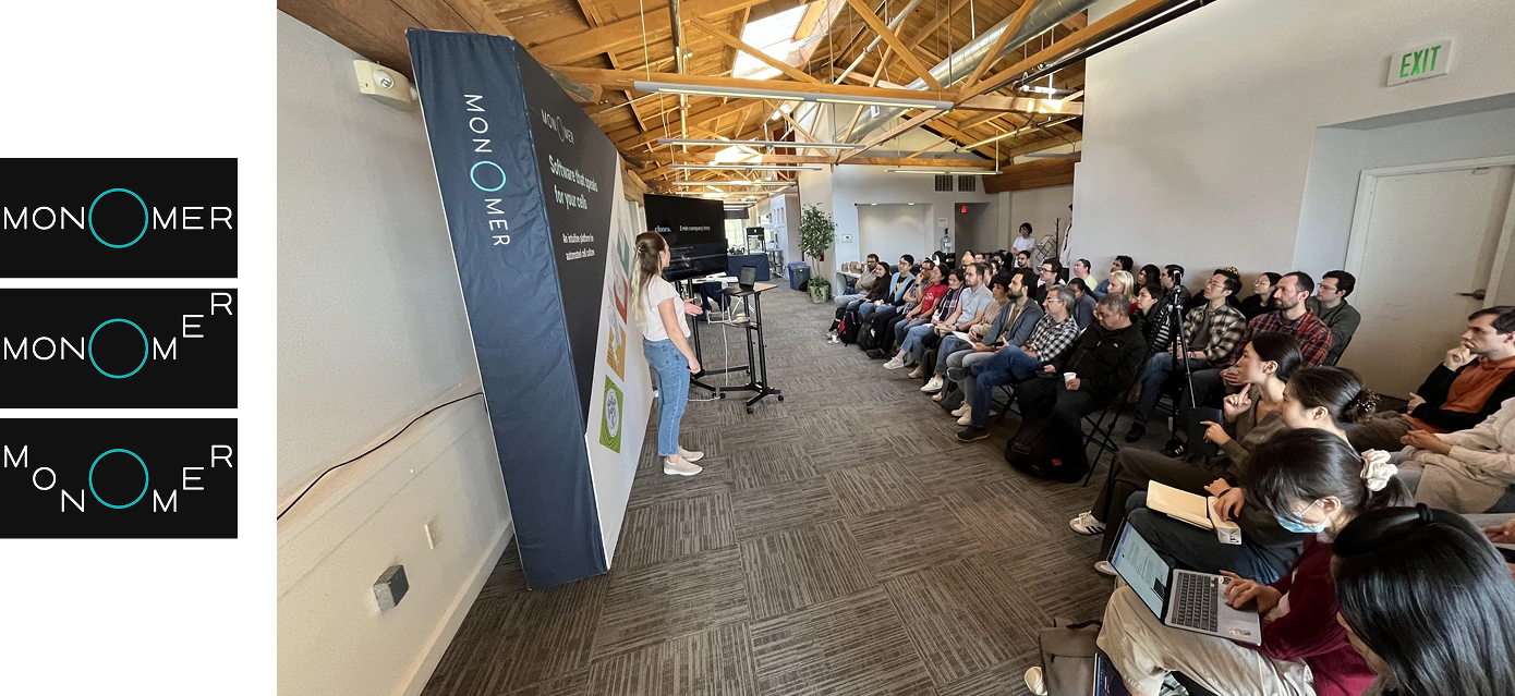
The Monomer logo echoes this idea through its large central “O.” Like Braun’s “A,” it anchors the name and turns a simple word into something memorable.
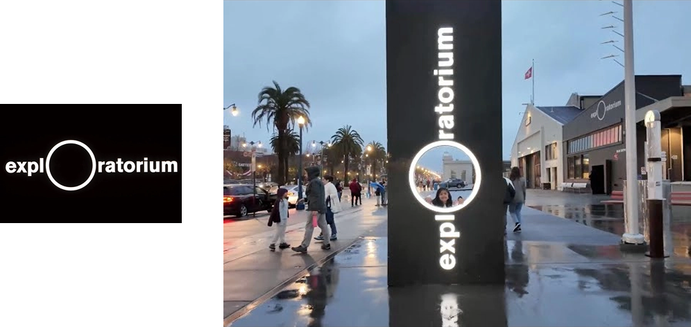
Exploratorium: Exploration
The Exploratorium is a hands-on museum where visitors explore science, art, and perception through direct interaction. It stands for experimentation and discovery. Its logo uses a large “O” as a visual focal point, similar to the Braun logo, but also suggesting a lens, a portal, an invitation for you to come and explore.
In monOmer, the central “O” carries a similar meaning. It invites looking closer and reflects the curiosity at the heart of science. It also represents a living cell, a petri dish, and the objective of a microscope.
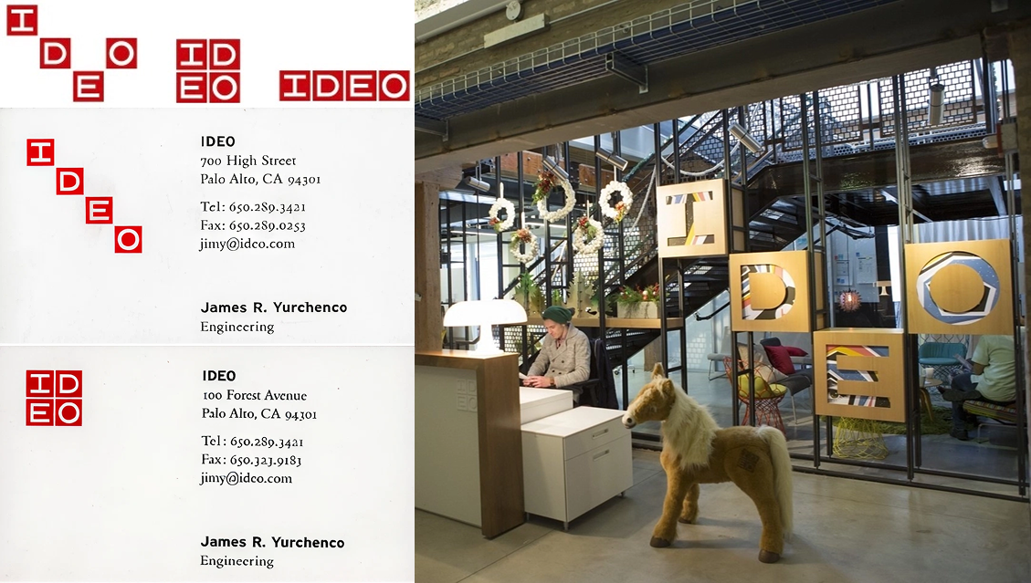
IDEO: Human-first
IDEO is a famous design and innovation consulting firm known for popularizing human-centered design and design thinking. Their logo is playful and unique in that its letters can shift and rearrange like blocks on a grid. [Core77]
Monomer pays homage to this company by adopting this modularity. The first three letters, “M-O-N,” and the last three, “M-E-R,” can move around the central “O” in different configurations.
Monomer: Bio
In chemistry and biology, monomers are basic building blocks that combine to form larger systems: amino acids form proteins, and nucleotides form DNA and RNA.
That metaphor also applies to the wet lab. Instruments are the building blocks that form a lab. They form the engine of the lab to generate data and further our mission to explore the unknown universe of living cells.
The Monomer logo reflects this idea visually. Its letters behave like modular components that can be arranged in different patterns around a central “O.”
The Monomer Logo Configurator
Go ahead and generate your own Monomer logo:
https://monomerbio.com/logo
--
Drop your comments on LinkedIn, HackerNews, or X.
